Redesigning seat maps and shipping code

I redesigned our flight seat map from an archaic layout into a modern experience using industry-standard language and usability best practices. When facing scope cuts, I used AI to personally code and ship Phase 2 to production. This final solution successfully eliminated a top-three user complaint while driving a 60% increase in flights booked with a seat.
Role:
Product Designer
Product:
Melon & FCM Booking
Type:
Responsive Web App
Industry:
Corporate Travel
Open Final Prototype
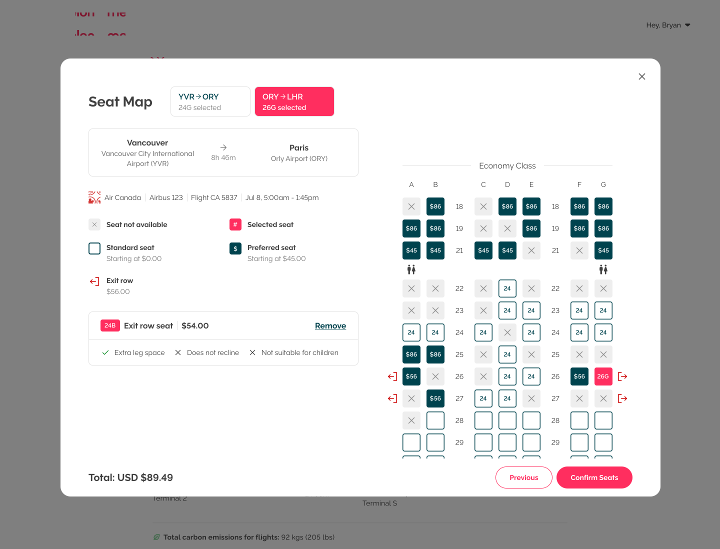
Screenshot of the final, high-fidelity flight seatmap interface modal in production. The layout features clear flight itinerary details on the left, an easy-to-read seat selection legend using industry standard terms, and an interactive, vertically oriented cabin map grid displaying upfront seat pricing directly on the icons.

The products

Melon and FCM Booking are B2B corporate travel tools built by the WhereTo team under the Flight Centre Travel Group ecosystem. Melon hosts small-to-medium businesses, while FCM Booking hosts large enterprise clients. As the Product Designer, my role is to design core components and scalable user experiences that serve both client segments simultaneously.

The opportunity

Seat selection is a core decision-maker for corporate travellers, especially high-volume road warriors and executive-level employees. When this experience falls short, it degrades the overall platform experience for our most valuable users. Our in-app surveys verified this, consistently ranking seat maps as a top-three user complaint.
Table of contents:
Before and afterUsability testShipping code
Success metrics

Before and after

Comparing the legacy interface to the new redesign

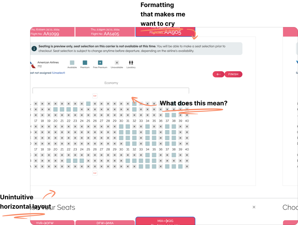
While anyone can quickly see that the original design is in desperate need of a refresh, let me highlight some of the critical issues.
Screenshot of the legacy horizontal flight seatmap interface with handwritten red annotations pointing out confusing legends, crowded formatting, and the unintuitive horizontal cabin layout

Key enhancements made in the new design

  • Familiar terminology and consumable information
    Our research proved the existing labels caused confusion, I replaced them with industry-standard terms like Preferred seat and Elite status seating. I also integrated essential decision-making details, including the specific airline and total flight duration.‍
  • Pricing that is not hidden behind a tooltip
    ‍
    Seat prices are now displayed upfront, right on top of the seat icons and legend.
  • ‍Introducing additional seat characteristics
    ‍
    To give travellers complete confidence, I included additional information detailing specific seat characteristics, such as extra legroom, restricted recline, or emergency exit row restrictions.
Screenshot of the redesigned flight seatmap interface featuring a modern vertical layout. Handwritten red annotations highlight key improvements, including upfront seat pricing displayed directly on the grid icons, clear industry terminology in the legend, and specific seat characteristics displayed below the flight selection details.

Usability test

Putting the new interface to the test with real corporate travellers

We put the new design through a remote unmoderated usability test using UserTesting.com. We recruited 12 business travellers across the US, UK, and Canada who currently use a competitor product and are planning to book a flight within the next 2 months. Participants were shown a prototype and asked to search for a flight, select seats, and check out to gather feedback.

Learning what worked: Travellers understand industry-standard language

Every single participant easily understood the new Preferred Seat, Standard Seat, and Elite Status Seat labels, accurately describing the characteristics of each one.
We asked participants to compare our seat selection process with competitor websites and received a high median satisfaction rating of 4 out of 5. Analysis of our detractors revealed that lower scores were driven entirely by technical Figma prototype constraints encountered during the test, which is thankfully a frustration I can now completely avoid in the future thanks to high-fidelity AI prototyping.

Learning what didn't work: Our new entry point was over-designed

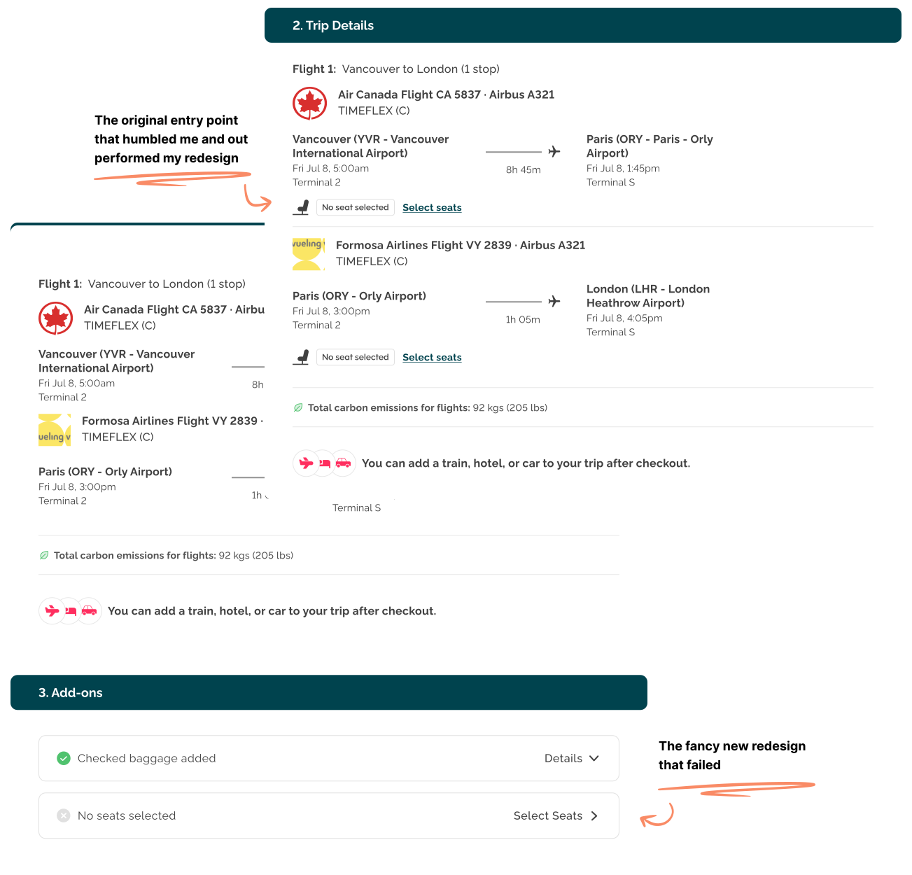
During our usability test, we showed participants two options for the checkout layout, alternating which one they saw first to avoid bias. Option 1 utilized the existing entry point located within the flight trip details, while Option 2 placed it within a new add-ons section that had been recently implemented in a previous project.

While I felt confident in this new design because it was visually clearer and took up more real estate, I knew moving the entry point carried inherent risks since it was physically disconnected from the flight details. To my surprise, the new location was a massive detractor, with 9 out of 12 participants explicitly stating they preferred the previous design.

Guided by this feedback, we moved forward with keeping the existing entry point location. Once we confirmed it as the more valuable entry point, we quickly followed up with a targeted visual redesign of the Trip Details card itself.
Shipping code

Shipping seat characteristics myself when engineering took too long

Open Final Prototype
Close-up screenshot of the selected seat details layout. A handwritten red annotation reads "This piece got cut from the scope, so I shipped it myself," with an arrow pointing directly to the live seat characteristics section displaying extra leg space, recline restrictions, and age suitability rules.
Months passed after the initial release with no signs of Phase 2 getting prioritized on the engineering roadmap. Having recently gained access to our codebase and Claude Code, with my team's go-ahead, I decided to ship it myself.

During the initial discovery phase, I collaborated closely with our engineers and learned that our supplier API was already sending the seat characteristic codes; our front-end just wasn't utilizing them yet. Using Claude Code, I easily navigated our repository and mapped the incoming data to the UI. I followed the exact same code processes and testing workflows our engineering team uses, passing our checks smoothly.

This release worked seamlessly, and I was thrilled to see the complete seat map redesign come to life in production. The best part came shortly after launch when our customer success team requested that I add even more characteristics based on positive user feedback.

Check out the high-fidelity prototype below to interact with the final design.
Open Final Prototype

Success metrics

Seatmap feedback no longer a top 3 user complaint

Through our in-app Voice of Customer surveys, seatmaps were consistently in our top three complaints every single month. Since releasing the new design and implementing the missing characteristics, that is no longer the case.

60%+ sustained increase in completed flight bookings with a seat selected

Based on year-over-year Mixpanel data comparing conversion trends following the feature launch, with the highest monthly increase spiking up to 362%.