Self-service hotel modifications for corporate travel

To design a self-service hotel modification experience, I ran a cross-functional workshop to gain alignment and map edge cases, iterated on early wireframes to land on an intuitive layout, and used unmoderated usability testing. The resulting design achieved a 79% conversion rate and an 85% task completion rate.
Role:
Product Designer
Product:
Melon & FCM Booking
Type:
Responsive Web App
Industry:
Corporate Travel
Open Final Prototype
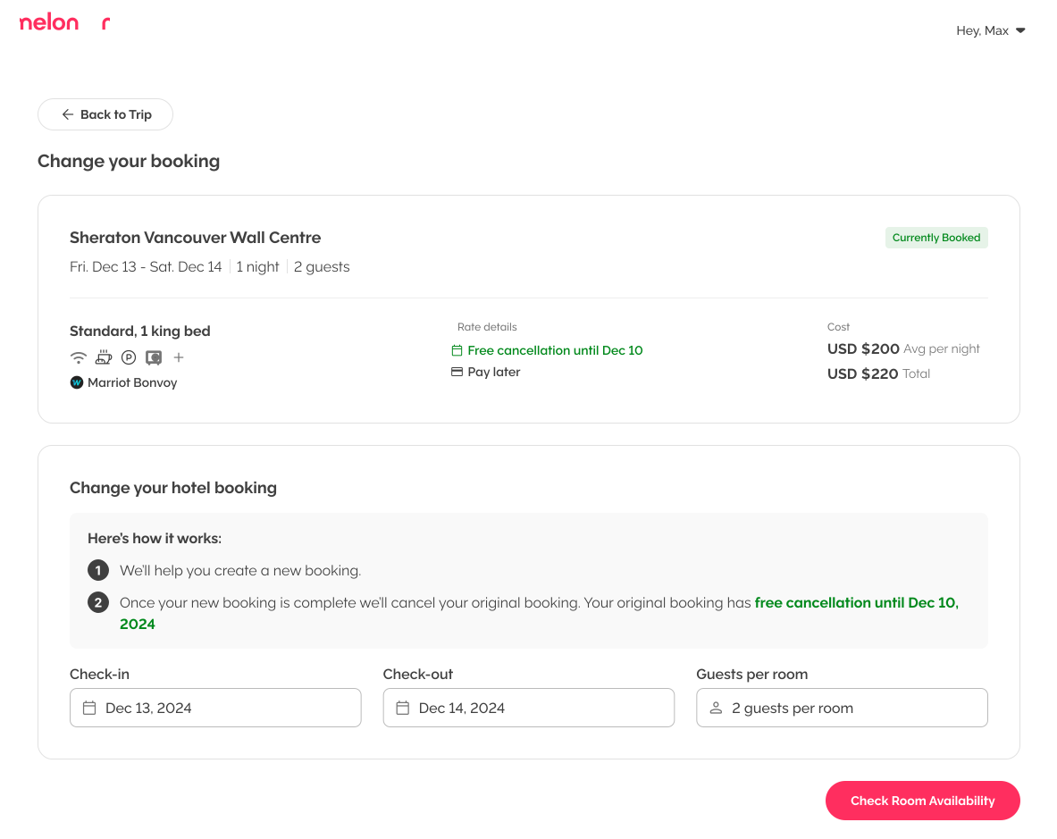
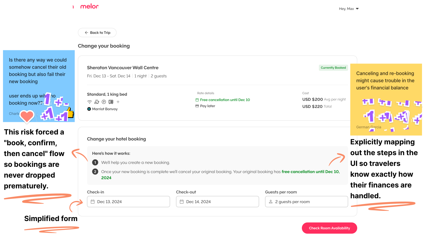
Melon "Change your booking" page. A card shows the current booking, Standard 1 king bed at Sheraton Vancouver Wall Centre, Dec 13 to 14 for 2 guests, with free cancellation until Dec 10, at USD $200 per night. Below it, a "Change your hotel booking" panel has a two-step explanation and check-in, check-out and guests-per-room fields, plus a "Check Room Availability" button.

The Products

Melon and FCM Booking are B2B corporate travel tools built by the WhereTo team under the Flight Centre Travel Group ecosystem. Melon hosts small-to-medium businesses, while FCM Booking hosts large enterprise clients. As the Product Designer, my role is to design core components and scalable user experiences that serve both client segments simultaneously.

The opportunity

Corporate travellers operate under tight time constraints and need their tools to be highly efficient. Previously, users had no self-service way to change their hotel bookings; even simple date modifications required them to start a live online chat with a travel consultant. This manual step created significant friction for busy travellers and heavily drained the time and resources of our internal support team.
Table of contents:
How it beganDesign explorationFinal solution & testing
Success metrics

How it began

Aligning the team and gathering ideas through a cross-functional workshop

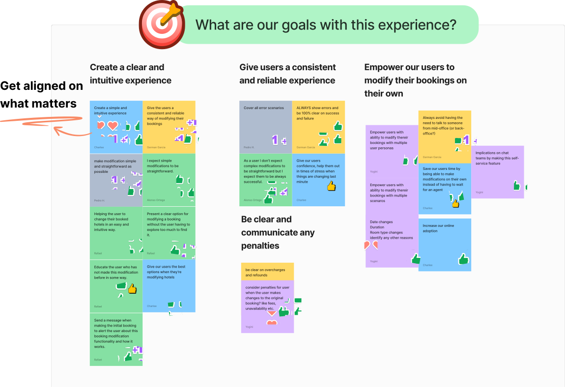
We started by defining our goals and potential risks, then I gave everyone a persona and scenario to sketch their own solution. We shared ideas, challenged assumptions, and looked for patterns and unexpected perspectives.


Workshop highlights

  • Aligned on UX Goals: Focused the team on creating a simple, reliable experience with a consistent way for users to modify bookings.
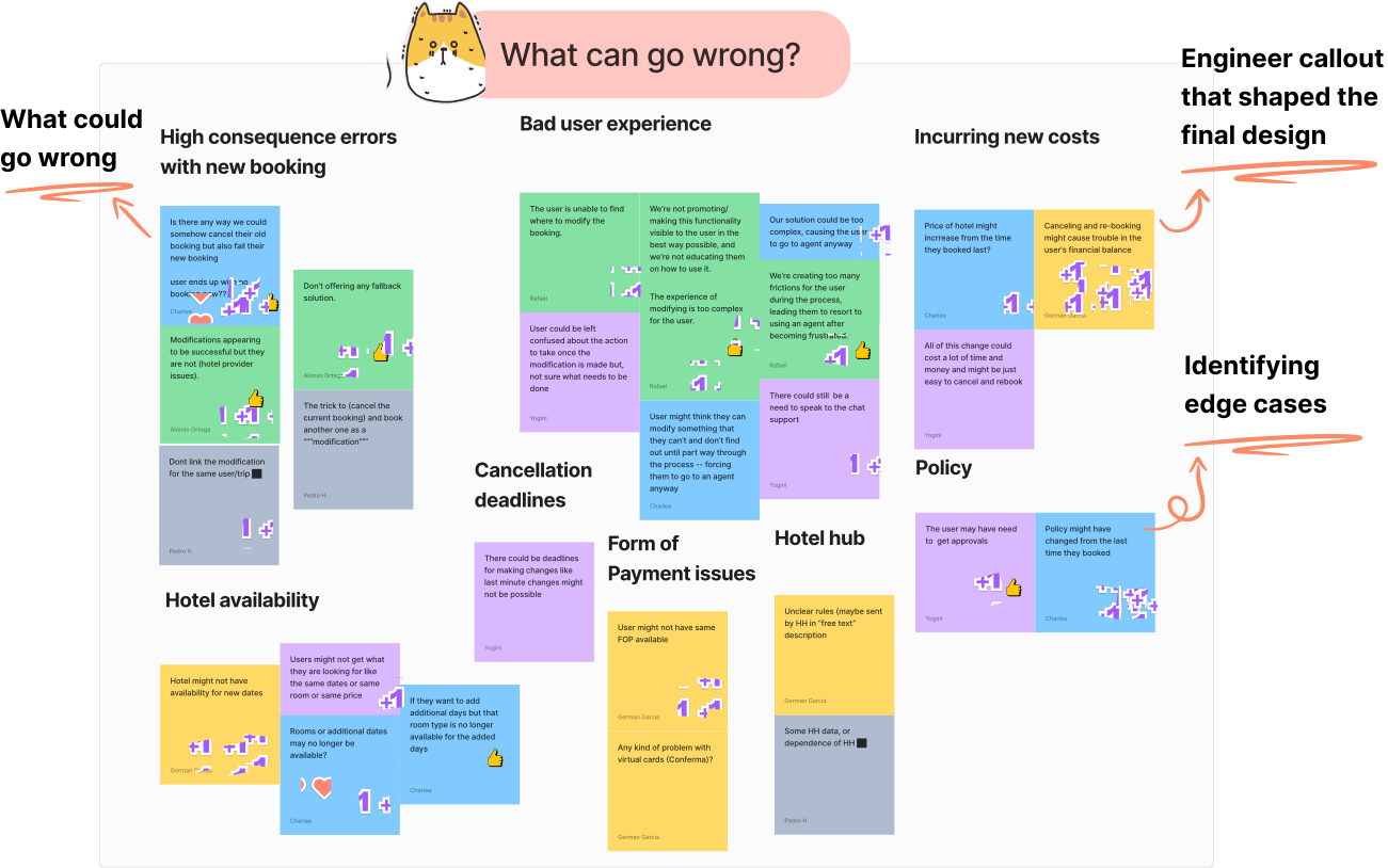
  • Identified High-Risk Errors: Mapped worst-case scenarios like a failed new booking occurring after an old one is cancelled to prevent leaving travellers stranded.
  • Welcomed Team Perspectives: Uncovered a risk regarding the traveller's financial balance that I hadn't considered alone, inspiring me to build complete transparency into the back-end process.
  • Uncovered Edge Cases: Surfaced vital nuances such as policy updates that occurred after the original booking.
Digital whiteboard titled "What are our goals with this experience?" with team sticky notes grouped into themes: "Create a clear and intuitive experience," "Give users a consistent and reliable experience," "Be clear and communicate any penalties," and "Empower our users to modify their bookings on their own." Notes include "ALWAYS show errors and be 100% clear on success and failure" and "Save our users time by being able to make modifications on their own." Annotation: "Get aligned on what matters."Digital whiteboard titled "What can go wrong?" with sticky notes grouped into risk areas: high consequence errors with a new booking, bad user experience, incurring new costs, cancellation deadlines, hotel availability, payment issues, hotel hub, and policy. Notes include "Is there any way we could somehow cancel their old booking but also fail their new booking?" Annotations: "What could go wrong," "Engineer callout that shaped the final design," and "Identifying edge cases."

Analyzing competitor solutions

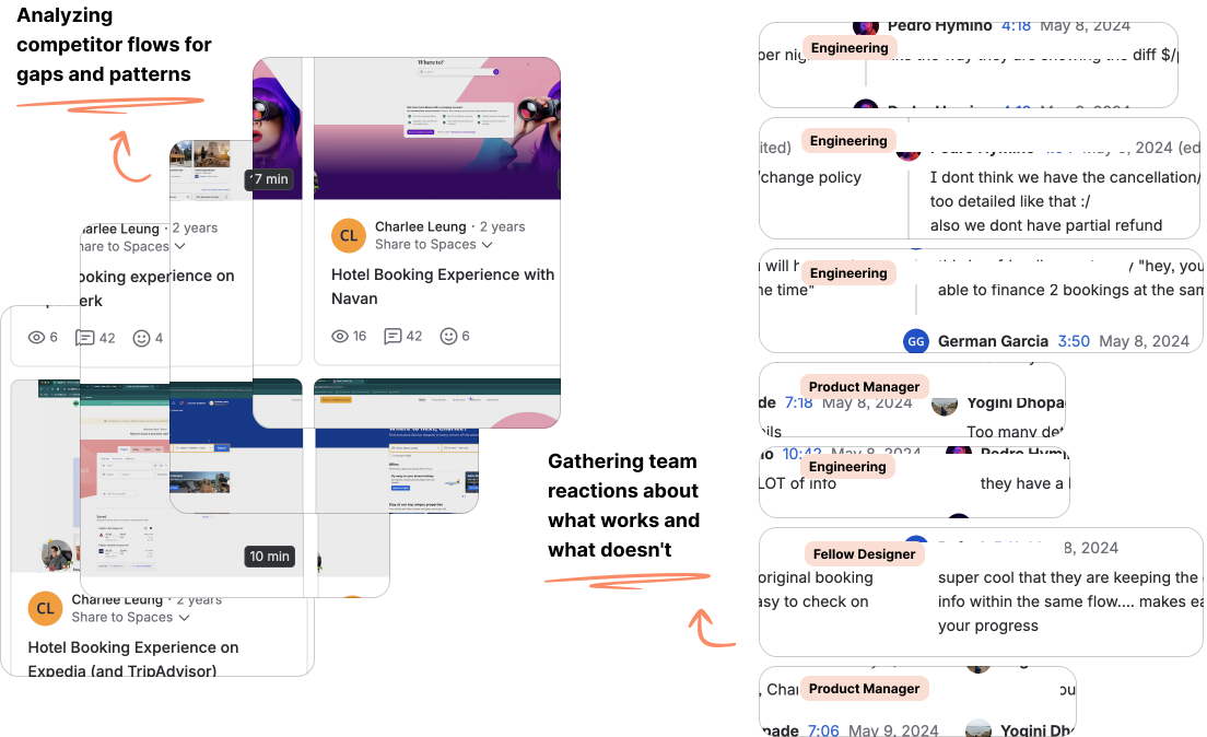
To familiarize myself and the team with the market, I recorded Loom videos auditing multiple platforms. I shared these recordings with my team, who left comments throughout to flag technical constraints and highlight user experience opportunities. This helped us identify industry patterns, align on what works versus what doesn't, and find clear opportunities to stand out.
Left: a stack of four Loom video thumbnails of competitor booking flows (Expedia and TripAdvisor, TravelPerk, Booking.com, Navan), each with view, comment and reaction counts. Right: team comments from Engineering, a Product Manager and a Fellow Designer, such as "like the way they are showing the diff $/per night," "Too many details," "they have a LOT of info," and "super cool that they are keeping the original booking info within the same flow." Annotations: "Analyzing competitor flows for gaps and patterns" and "Gathering team reactions about what works and what doesn't."

The audit was highly collaborative, generating over 120 timestamped comments from the team and driving critical design decisions. Some key takeaways included:

  • Designing a dedicated experience: Seeing how easily users get overwhelmed by information validated our workshop goal of keeping this experience simple and intuitive. It confirmed we needed a dedicated modification flow rather than recycling our existing full shopping experience.
  • Prioritizing comparison information: We realized the immense value of displaying clear price differences and side-by-side booking comparisons throughout the journey.
  • Validating technical workarounds: Due to limitations with our 3rd-party supplier API, we were forced to use a "book-then-cancel" logic to modify dates. Discovering that our competitors rely on this exact same workflow validated our engineering approach and confirmed we were navigating industry-standard technical constraints.

Design exploration

Shaping a simple & intuitive solution through iteration, collaboration, and feedback

With a clearer picture of what we were solving for, I started turning the workshop conversations into wireframes. From there, the design evolved through multiple rounds of feedback with designers, engineers, product, and stakeholders. Each round helped challenge assumptions, uncover constraints, and simplify the experience. Here are a few highlights of how the design evolved along the way.

Iterating the entry point

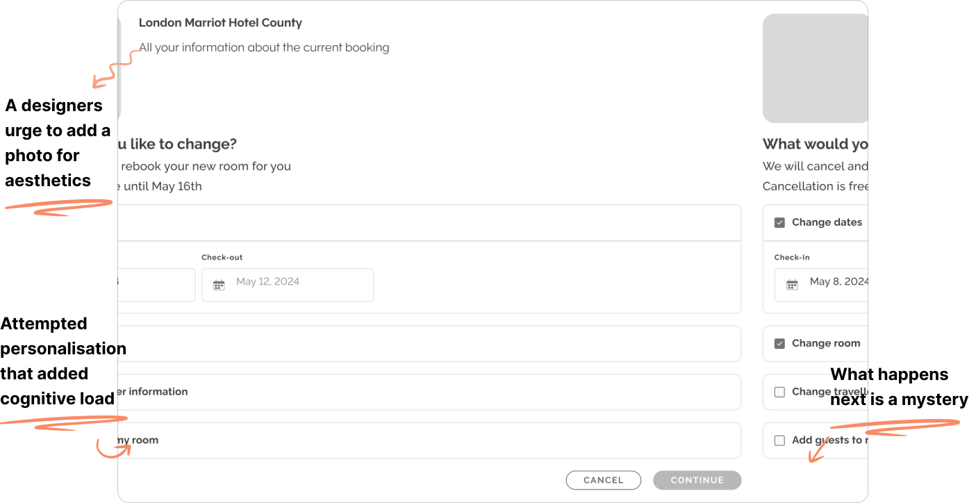
The entry point started as a dynamic form with multiple checkboxes and information input fields. I was exploring how the experience could adapt to different scenarios and eventually support a more hyper personalised experience.
Early wireframe of a form for changing a hotel booking. A grey photo placeholder sits above "What would you like to change?" with checkboxes for Change dates, Change room, Change traveller information and Add guests to my room, plus Cancel and Continue buttons. Annotations: "A designers urge to add a photo for aesthetics," "Attempted personalization that added cognitive load," and "What happens next is a mystery."
As I worked through the flow, I realized that much of the information I was collecting didn’t actually affect what came next. I simplified the experience into a single, more focused flow, removing inputs that weren’t serving a purpose. I also gave the modification process explanation more visual hierarchy, adding enough detail to make the steps clearer and more transparent.
Final "Change your booking" screen with the current booking card, a "Here's how it works" two-step explanation, and check-in, check-out and guests fields. Two sticky notes and orange annotations surround it. Sticky notes: "Is there any way we could somehow cancel their old booking but also fail their new booking?" and "Canceling and re-booking might cause trouble in the user's financial balance." Annotations: "How I shaped the engineering solution: book, confirm, then cancel," "How engineering shaped my solution: Clear expectations, no surprises," and "Simplified form."

Iterating the room selection flow

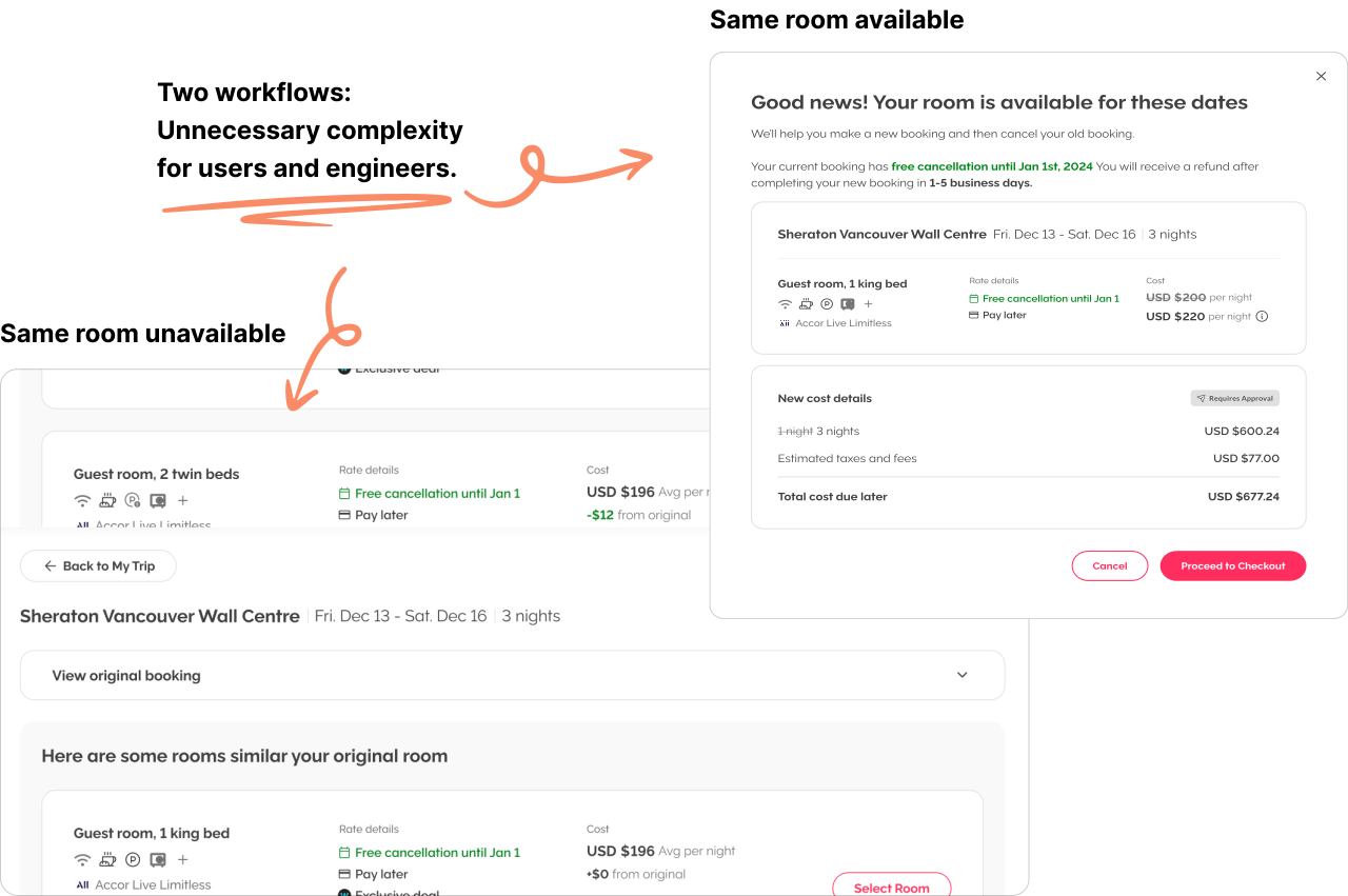
After the entry point users moved into the room selection step. Again, in an effort to create a hyper-tailored experience, I initially split "same room available" and "choose an alternative" into two separate flows. If the original room was available, users saw a simplified confirmation modal; if not, they were sent to a full room-selection page.
Two earlier designs side by side. On the right, "Same room available": a modal reading "Good news! Your room is available for these dates," with a cost breakdown and Cancel and Proceed to Checkout buttons. On the left, "Same room unavailable": a full page of similar rooms to select. Annotation: "Two workflows: Unnecessary complexity for users and engineers."
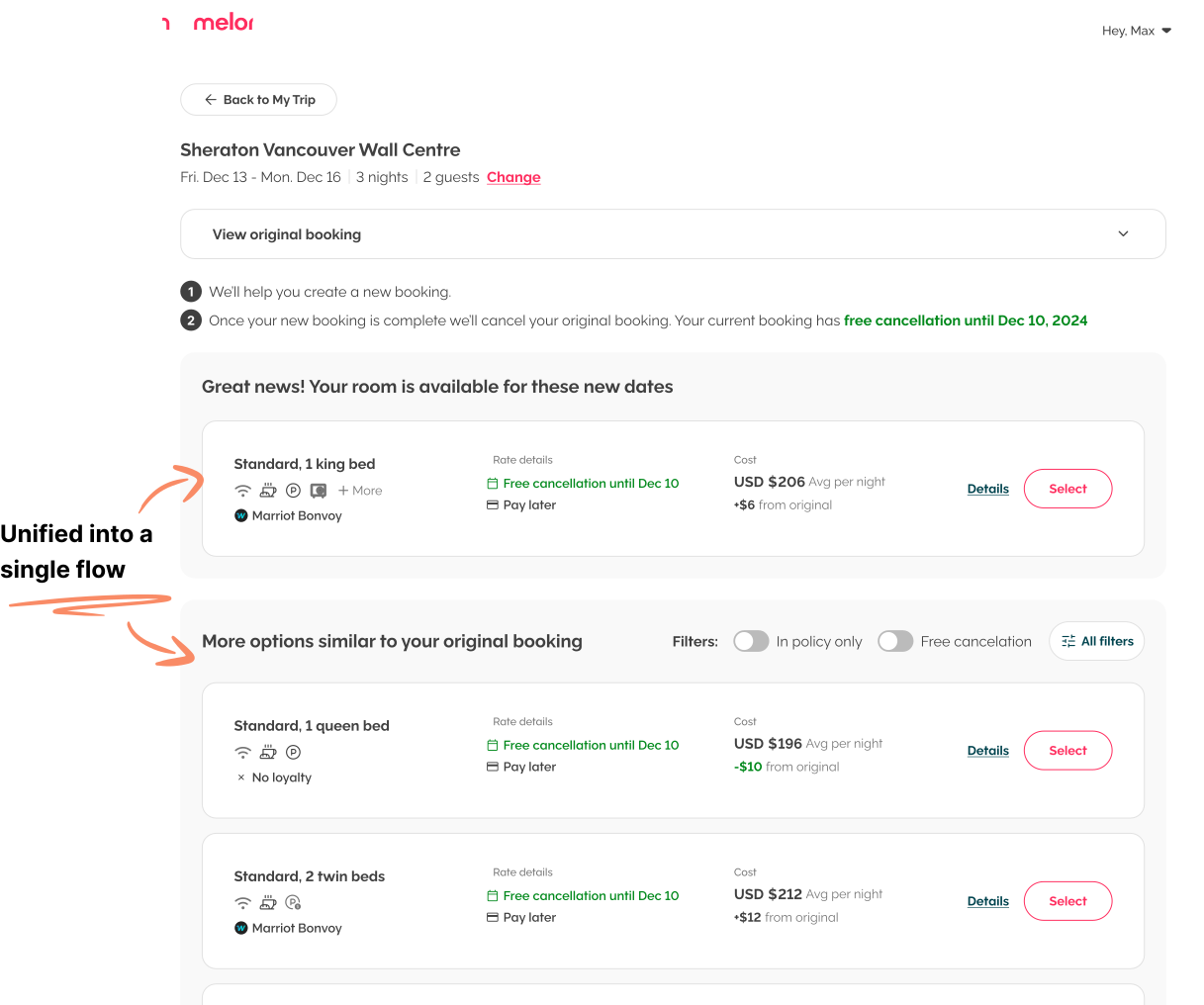
As I iterated, I realized both paths were solving the same problem: helping users choose the room they want to book. I combined them into one experience, with the original room highlighted at the top when available, followed by alternative options.
Final Melon room selection page. At the top, "Great news! Your room is available for these new dates" shows the original room, Standard 1 king bed, at USD $206 per night, +$6 from original. Below, "More options similar to your original booking" has In policy only and Free cancelation toggles, an All filters button, and alternative rooms. Annotation: "Unified into a single flow," with arrows to the available room and to the alternatives.

Final solution & testing

Validating the polished design through unmoderated user testing

Open Final Prototype
We put the final experience through an unmoderated usability test on UserTesting.com with 12 active corporate travellers. Users were recruited evenly across the US, UK, and Canada to validate the experience across our core global markets

Learning what worked: Free cancellation modifications, receiving an excellent 5 out of 5 score

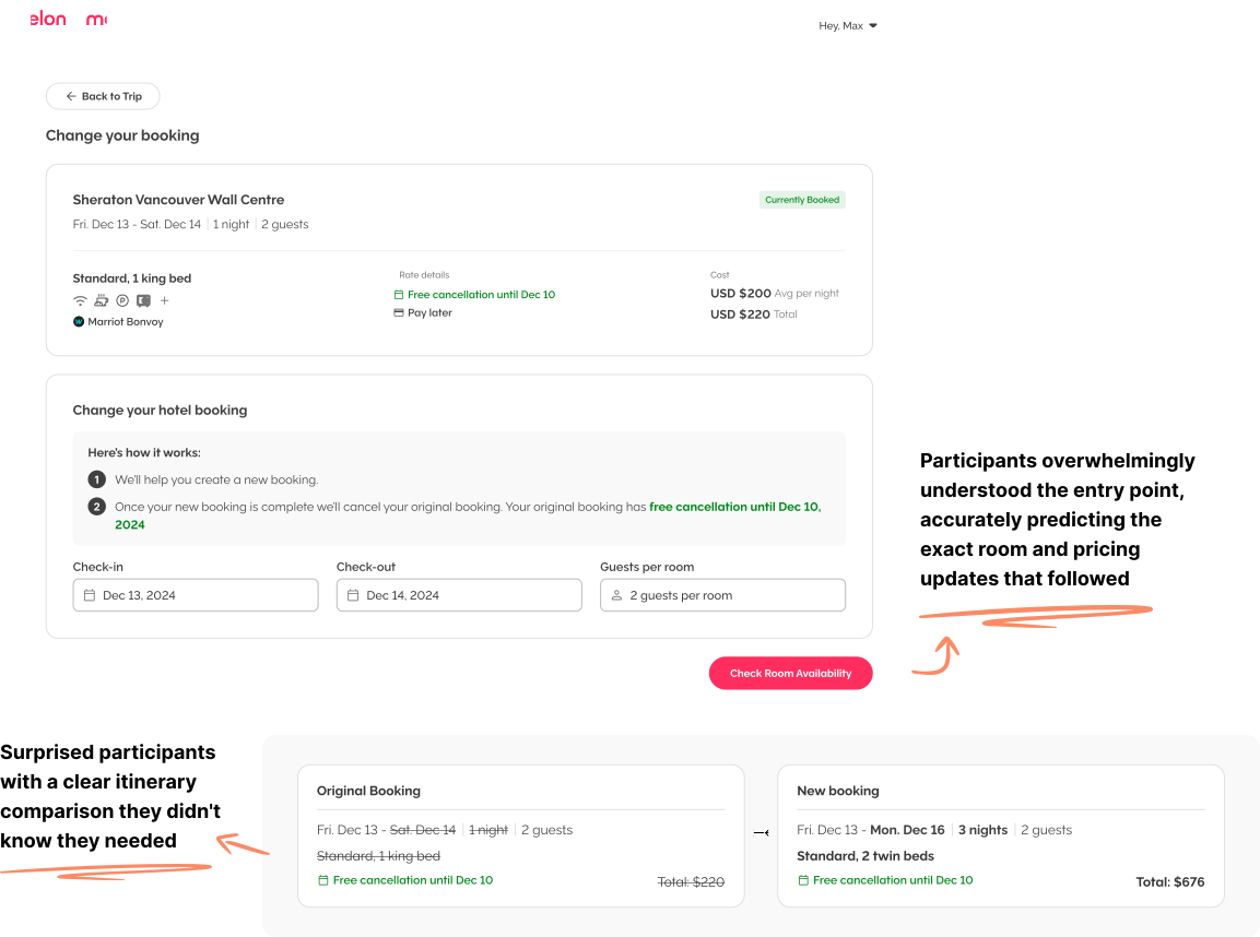
The testing validated the success of our primary user flows. Participants overwhelmingly understood the functionality of the 'Check Availability' action, anticipating the exact room availability, pricing adjustments, and layout changes that followed.

Additionally, the side-by-side booking comparison proved highly effective, with multiple participants explicitly praising how clearly it visualized their itinerary changes.

The results gave us confidence in the design, allowing us to move forward and ship the feature!
The final change booking entry screen above a comparison of the original booking and the new booking. The original (Standard 1 king bed, 1 night, $220) is struck through, and the new one (Standard 2 twin beds, 3 nights, $676) is in bold. Annotations: "Participants overwhelmingly understood the entry point, accurately predicting the exact room and pricing updates that followed," and "Surprised participants with a clear itinerary comparison they didn't know they needed."

Learning what didn't work: Non-refundable self-service modifications lack value

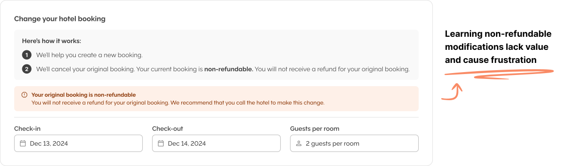
While refundable changes were easy to automate, non-refundable rates introduced a friction point where software couldn’t match human expertise. Our initial test showed that simply displaying warnings and telling users to call the hotel directly caused frustration. Users didn't want to waste time calling just to be rejected.

Realizing self-service offered zero value here, we shifted our strategy to intentionally route non-refundable changes to our expert travel consultants. Automating the simple, refundable changes clears their queue, freeing them to personally negotiate with hotels on the traveller's behalf, with the possibility of saving users from forfeiting their original purchase.
"Change your hotel booking" panel for a non-refundable booking. The explanation says "Your current booking is non-refundable. You will not receive a refund for your original booking," and an orange warning reads "Your original booking is non-refundable. We recommend that you call the hotel to make this change." Check-in, check-out and guests fields sit below. Annotation: "Learning non-refundable modifications lack value and cause frustration."

Success metrics

79% of users successfully change their hotel dates

Based on Mixpanel data tracking among users who initiated a date change modification. For a first live iteration, this represents a major win, as the remaining drop-off was driven by expected corporate travel behavior rather than design friction. Travellers may choose not to commit if rates increase close to departure, if they need internal company sign-off before approving new costs, or if their exact room type is no longer available.

85% of users said they successfully changed their hotel booking

In an active in-app survey, 51 of 60 respondents who visited Trip Details completed their task successfully. We expect the remaining users were looking to change non-refundable rates, which we intentionally route to travel consultants.